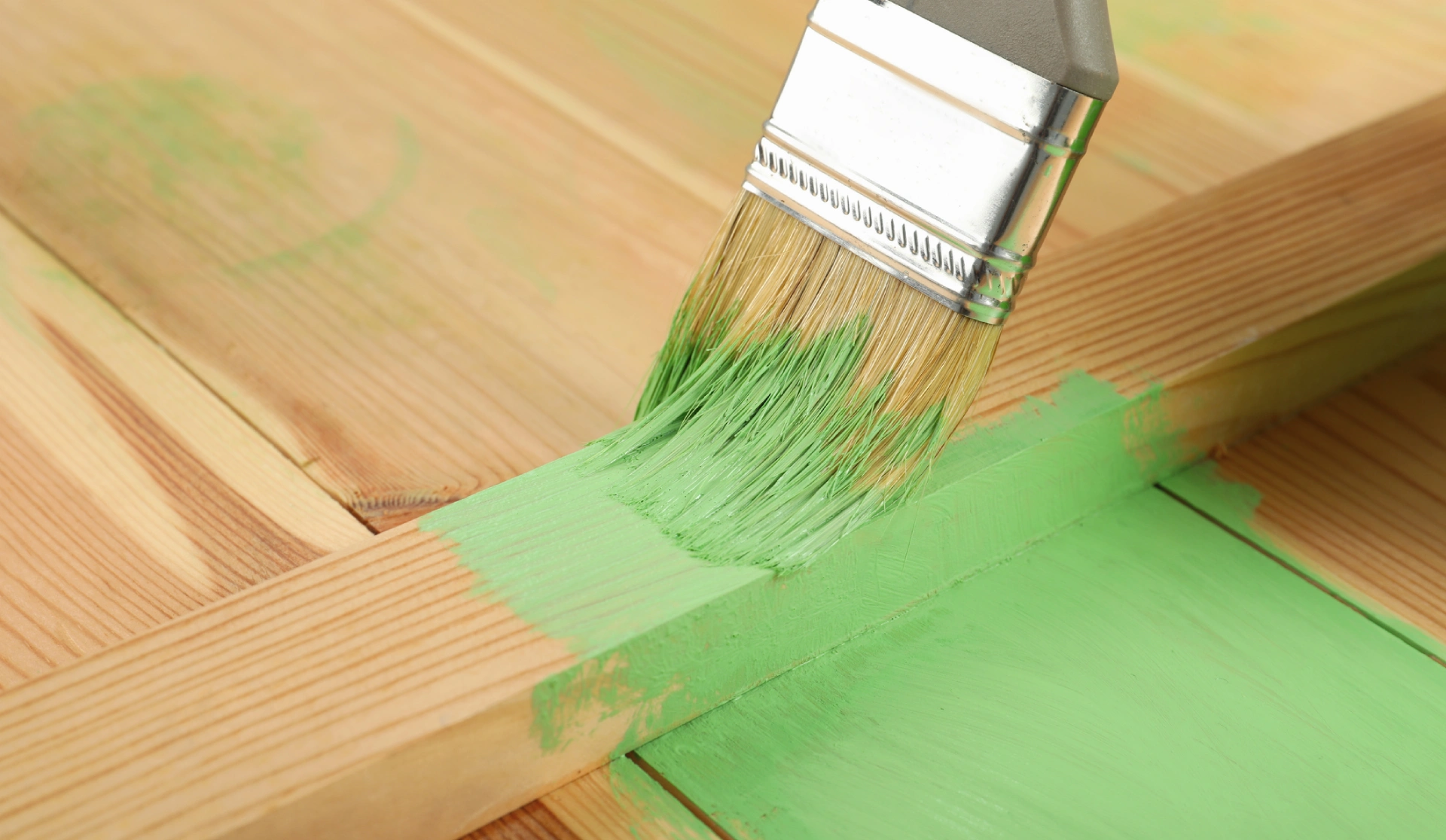
Best Paint for Wood
Painting wood protects it from the elements, from cracking and seals it so it ages well. Depending on if the wood is interior or exterior,


Painting wood protects it from the elements, from cracking and seals it so it ages well. Depending on if the wood is interior or exterior,
Have you ever tried to paint a home that was covered in incredibly busy wallpaper? (To envision this, think of the décor and wallpaper at

You’ve just been through a big move after spending weeks packing and organizing. However, you won’t be able to feel happy and comfortable in your


Are you looking to freshen up your home’s interior in the new year? Luckily for you, now is the perfect time to start a paint project. It will be easier to paint and ventilate your home as the weather is warming up, and then your space will be in tip-top shape just in time for all the parties, hosting, and gatherings that happen during the summer months. So now that you’ve decided that it is the perfect time to dedicate some time and money to an interior paint project, you just need to find the right paint. The only problem is that choosing paint is a lot easier said than done, right?
Luckily, we’ve compiled some of our favorite spring paint colors that are going to be very popular this year. No matter what your personal interior design style is, there should be a paint color that will match anyone’s interior space. And maybe you’ll be creatively inspired and decide to go with a newer, bolder paint color this year! So, without further ado, here are our must-have spring paint colors from Vista Paint.
 |
Lightest BlueStart off your spring season with the lightest, airiest blue. This blue will make your room feel large and trendy. This blue also has a slightly warm gray undertone, making it a new neutral to match with bolder colors. Options from Vista Paint are Surf, Cool Sky, and Simple Serenity. |
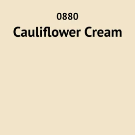 |
Creamy YellowBright, bold yellows haven’t been popular for a few years, but this creamy yellow is definitely going to turn some heads this season. Imagine a warm cream color that has just a touch more yellow than most creams or ivories. This light yellow can make any space feel cozy and inviting and well feel fresh and timeless at the same time. Options from Vista Paint are Cauliflower Cream, Perky Tint, and Honey Cream. |
 |
Beige-y PeachThis peach isn’t as pink or rosy as other shades of peach. Instead, this peach is a little more faded with beige and tan undertones. While it brings warmth and a fun color pop, it isn’t too overwhelmingly pink. Options from Vista Paint are Wispy White, Apricot Spring, Shooting Star, and November Leaf. |
 |
Pastel LilacDon’t forget to add a touch of purple! This pastel lilac will be perfect for this time of year. It is just light and bright enough to make your space feel open and clean, but it also has enough color to stay current and popular through the summer. Options from Vista Paint are Venetian Rose, Baby Girl, Pink Heath, and Pink Beauty. |
 |
Pink BeigeIf you want a more subdued peach option, you might like a pink beige instead. This color is a light, creamy tan with the slightest hint of pink. This adds a romantic, feminine touch to the color that makes any space feel bright and unique. Options from Vista Paint are Angel Breath, Sand Island, Dainty Debutante, and Antoinette Pink. |
 |
Muted NavyTo achieve more depth and variation, include a muted navy. This won’t be as dark or as bold as a traditional navy but instead will be a little bit lighter with a faded touch. This gorgeous color can pair well with any of the light, springy colors above. Options from Vista Paint are Blue Jacket, Madonna Blue, and Blue Depths. |
 |
Deep Olive GreenFinally, to add some contrast to your décor, fall in love with this deep olive green. In past years, sage green and light olive have been popular, but this year the depth and drama of deep olive green are here to stay. Options from Vista Paint are Mother Nature, Clover Patch, and Green Column. |
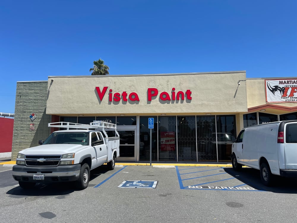
If you’re looking for a gorgeous, vibrant paint color that has been trending as of late, there are probably a number of paint stores that could mix it up for you. However, if you also want your paint to have increased durability and scratch-resistant qualities, you probably shouldn’t shop at just any old big box store. Shopping at a specialized paint store that is known for the quality of its product will help you to get the results that you really want to see from your paint job.
When you buy your paint from Vista Paint, you’ll always get affordable and long-lasting paint without sacrificing any quality. Their paint products are designed to be fade, scratch, and damage-resistant, making them a good fit for any home, even if you have lots of pets or kids. Vista Paint also puts a lot of work into creating and obtaining the most beautiful paint colors to keep up with timeless shades and current trends. To find the right color for your space, simply view their color palette and browse their products to find the color and quality you’re looking for. You can easily order paint color chip samples by filling out this form on their website. This could be especially helpful if you’re having difficulty deciding between multiple gorgeous colors for your space!
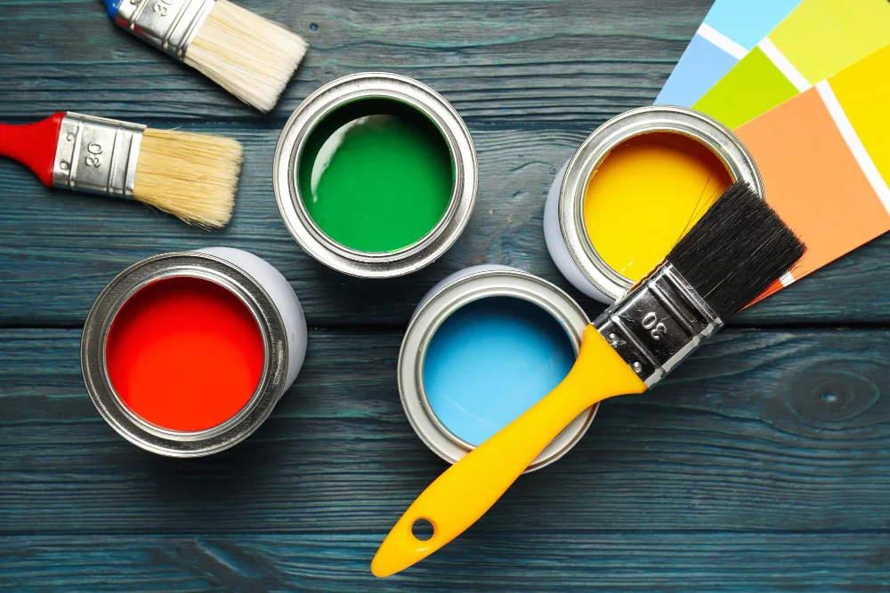
When you’re going to be painting by yourself, you’ll have to spend some time researching what supplies you’ll really need. One of these essential supplies might be primer. With certain types of paint, using a paint primer is the only way to guarantee that your paint will successfully and permanently adhere to your given walls or ceiling surfaces. There are different types of primers that pair perfectly with different types of paints, depending on the base of the products. You might also choose a particular primer depending on the type of material that you’re painting. A primer needed for a wood painting project will be different than a primer needed for drywall. For example, oil-based primer works really well on unfinished drywall surfaces.
To learn what additional supplies you’ll need to complete your painting project, check out our blog article on painting supplies!
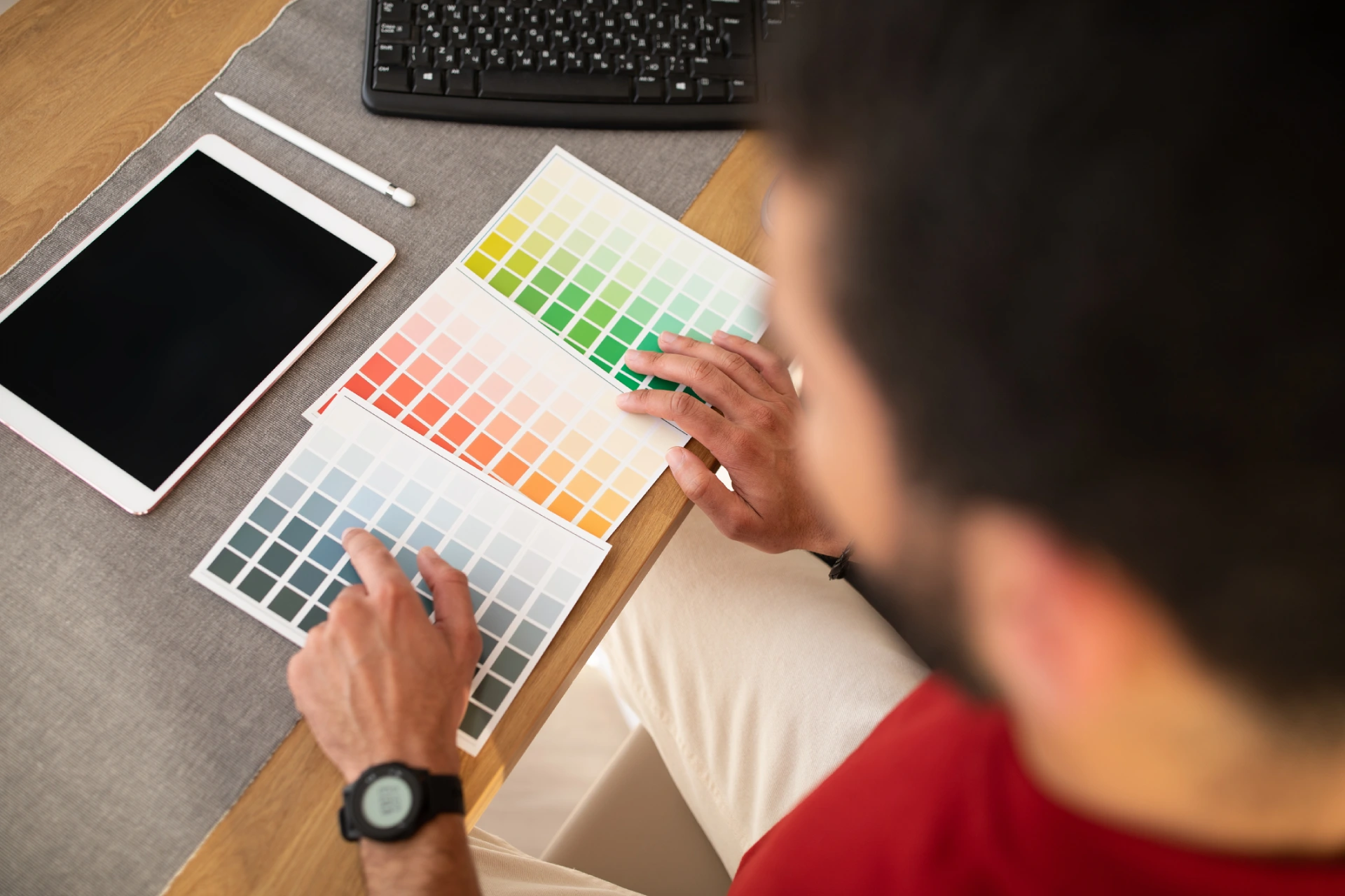
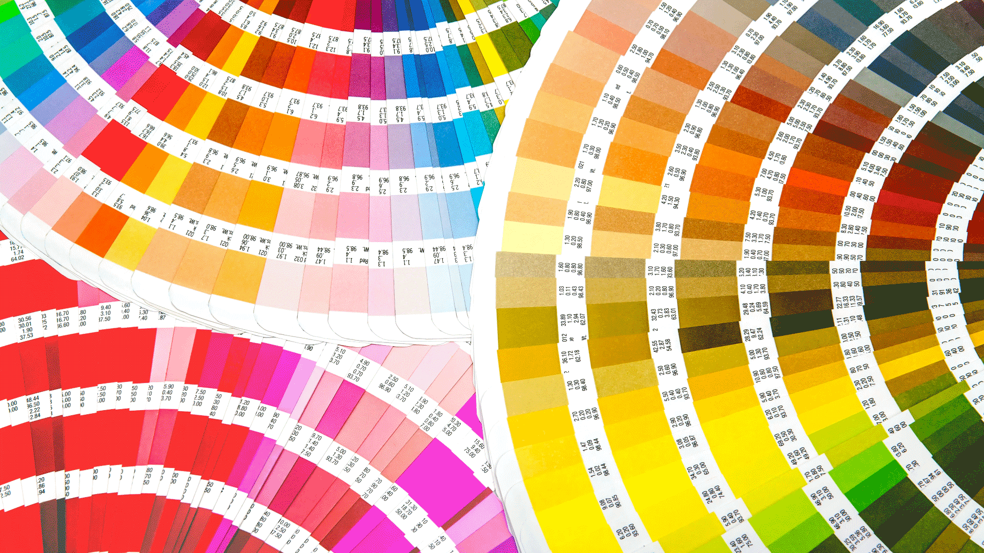
Let’s be honest, finding the right paint color palette for your home can be quite the challenge. You might see paint colors online on blogs or social media that you love but aren’t sure if those colors will look good in your home with your personal home decor style and layout. Maybe you’re just getting into your first home and you’ve never been able to paint or decorate a home to your personal taste. Before you start feeling overwhelmed, put some trust in our favorite tip for homeowners looking for the right paint color: a paint color palette.
A paint color palette features hundreds of different paint colors that could look beautiful in your home. These options allow you to look at different undertones and pigmentations until you find precisely the right color for your space. Additionally, when you’re trying to find the right paint color palette for your home, it can be helpful to examine color families. Here are a few tips that can help you find the right color family for your space.
A color family is a grouping of colors that all have the same particular shade or undertone. Usually, color families are gathered together on the color wheel that is commonly used in art and art education. Vista Paint organizes their paint color palette into the following seven color families to make it easy for you to find the right paint color for your project. Here are the color families that they include. Each color family page features some visual examples and descriptions to help you find the right paint color for your home.
 |
RedsThis color family includes anything from traditional reds to deep maroons to light pinks to rusty brick reds. |
 |
BluesThis color family includes anything from baby blue to bright royal to dramatic turquoise to deep, moody navy. |
 |
YellowsThis color family includes anything from bright yellows to warm creams to cozy mustard colors. |
 |
VioletsThis color family includes anything from hazy lavenders to romantic purples to trendy mauves. |
 |
OrangesThis color family includes anything from bold oranges to happy peaches to trend-setting rusts. |
 |
GreensThis color family includes daring bright greens, traditional forest greens, popular sage greens, and more. |
 |
NeutralsThis color family includes many timeless neutral shades such as grays, whites, taupes, and more. |

If you’ve never had to choose your own paint color before, chances are you’ve also never used a paint color palette before. This process can be more intuitive than you might think. Here are a few of our best tips on how to successfully use a paint color palette in a way that will help you choose the ideal paint color for your home.
Now that you’ve found the perfect paint color for your chosen paint project, you’re almost ready to get started. But before you buy your paint, you should consider the different paint finishes that are available to you. Paint finishes refer to the level of sheen or shininess that a certain paint has once it is completely dried on a wall or surface. Different levels of sheen can definitely affect the aesthetic of a room. For example, in a nursery, you might want a pretty matte finish with only the slightest sheen to make it feel cozy and clean. You would also generally want a matte finish in a kitchen area, as a shiny finish can make your walls or cabinets look greasy and unclean.
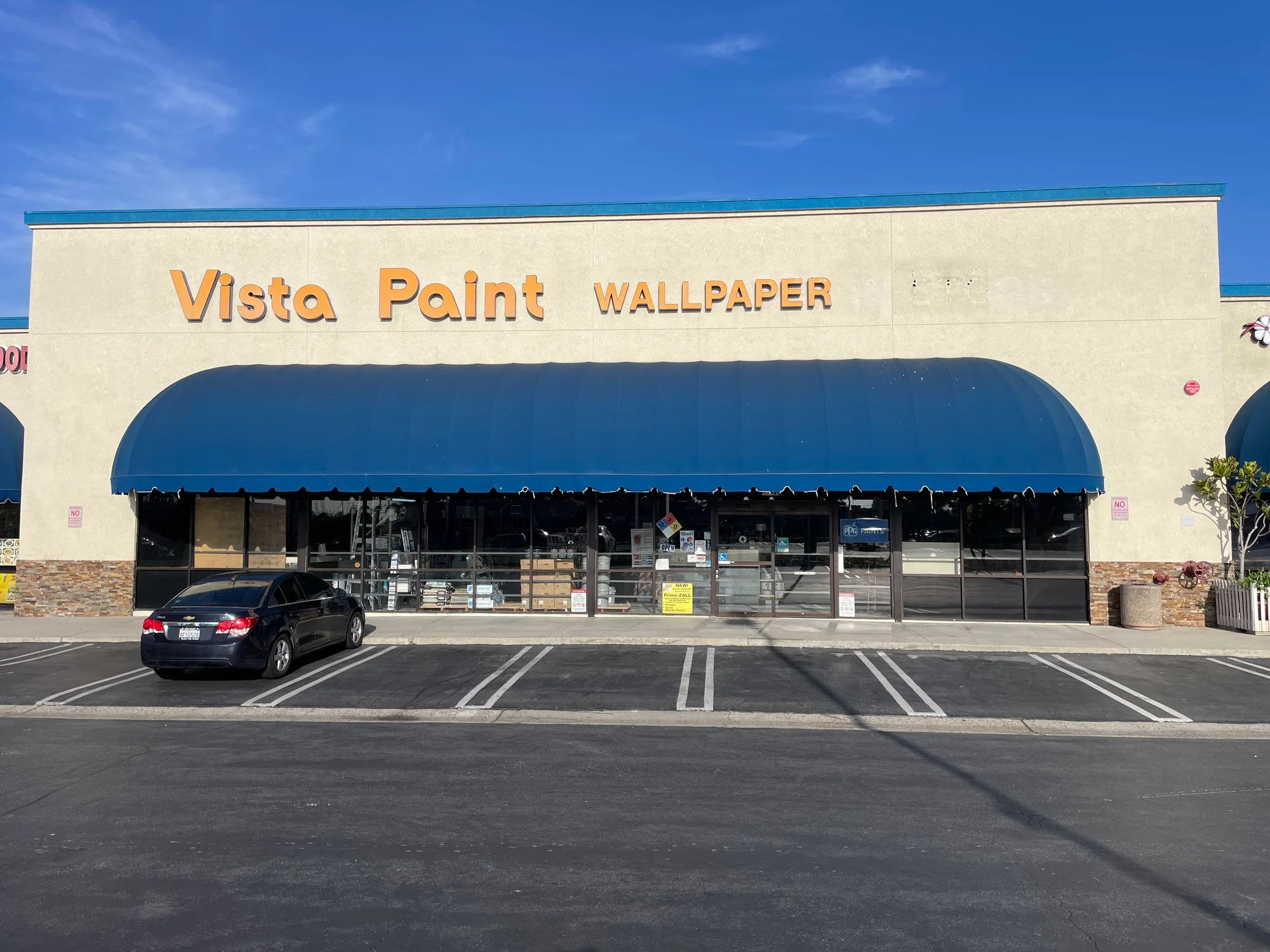
Sometimes you might think it is easier to shop at a “big box” store such as Home Depot. While these types of stores might have more convenient locations for you, their paint products simply won’t have the quality that your projects require. If you want to avoid painting and repainting your home, you should choose a paint brand that will provide you with high-quality, damage-resistant products that will last beautifully for many years.
Vista Paint prides themselves in creating paint products of the highest quality. Their bold and beautiful paint colors will last for years to come without any scratches or marks. Some of their paints even come “pre-primed” which will save you one step in the painting process. They also make their paints with low or zero VOCs (Volatile Organic Compounds) so your house or family won’t be exposed to any potentially harmful chemicals. If you want to preview their colors and see how their products will work for you, you can order paint color chips and samples and have them shipped straight to your doorstep! To see their beautiful paint colors, simply fill out this paint color chip order form to have your color samples shipped to you.
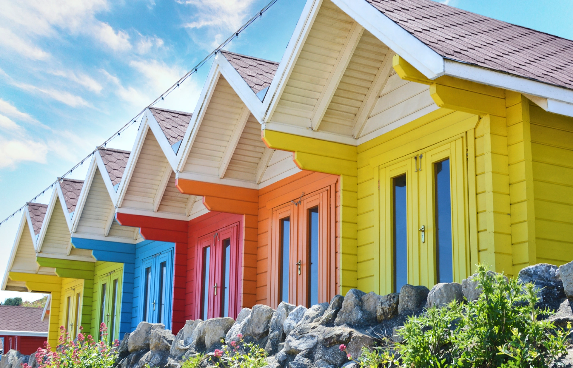
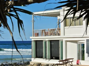
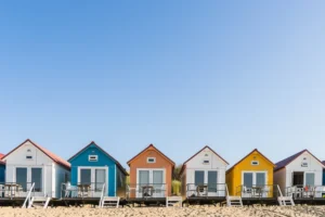
Beach houses are known for their classic exteriors, siding and white trim. Their colors can be inspired by the natural colors found around them. From sea glass to warm sand and cool water, there is no end to the inspiration found in the natural world of the San Diego beach.
If it’s time to repaint your beach house exterior, Vista Paint has lots of options for you for paints that are durable, colorful and vibrant.
First, exterior surfaces, especially those on the San Diego beach, need to hold up to saltwater, cool air, damp mist and bright sun. That’s why your first step is finding an exterior primer that can help seal the wood siding to make it ready for painting.
First, wash the exterior of the home to remove any mold, mildew or salt build-up. You can’t paint a dirty surface, so washing it and letting it dry fully is a necessary first step. Next, patch or caulk any holes or gaps as needed. Read the instructions to determine how long the caulk needs to cure.
Repainting is also the time to check on the condition of your boards and to see if any need to be replaced. Old boards can be painted, but they won’t necessarily hold up as well as new ones. Replace anything that is split, warped or missing pieces.
Now it’s time to prime your home.
For wood priming, Vista Paint recommends the 4200 Terminator II, which is a water-based primer suitable for exterior use. It prevents stains and offers superior flexibility, which means it won’t crack as wood shrinks and expands due to exposure to moisture. That makes it a stellar choice for a beach house.
018 100% Acrylic Block Filler and 040 Block Kote are ideal primers for stone, stucco or brick that needs painting. These fill in gaps, giving a solid surface on which to apply your color.
Once you’ve primed your home and it has dried for the recommended time, you’re ready to paint. Exterior paint is required for the exterior of a home because it has a special formulation that lets it resist weathering and UV light. Choosing the wrong paint means you could wind up having to repaint more quickly than you would like.
1900 Weather Master is an acrylic exterior paint that resists mildew and is appropriate for all surfaces except metal. It comes in custom colors and is specially formulated to hold up against all kinds of weather without chipping, peeling or fading.
3000 Acribond provides a durable, flat finish that is mildew resistant. This exterior paint is perfect for wood surfaces or properly primed concrete and masonry.
Once you have picked your paint, it’s time to choose a color. Classic colors for San Diego beach houses are inspired by the coastline and all the colors it presents. From warm sand to cool mist, there is no end to the variety of natural colors you can choose from. Exterior paint tends to be a flat finish so the color doesn’t reflect as much light. This is especially important if you pick a lighter color that is naturally light-reflective.
If you want your beach house to blend into the landscape rather than standing out, these neutrals are the perfect choice to help your home look like it sprang up out of the sand.

The San Diego coastline is one of the most beautiful in the world when the mist has burned off and all you can see is sky and water.

Many happy memories are made searching for the perfect seashell or piece of sea glass. Bring those colors home with these shades.


These paint colors give you so many options for painting your beach house. Whether you are looking for a neutral or you want your beach house to be visible up and down the coastline, Vista Paints has plenty of colors to choose from. Their high-quality exterior paints go on smooth and adhere so no amount of sand, surf or rain will remove their luster.


Painting wood protects it from the elements, from cracking and seals it so it ages well. Depending on if the wood is interior or exterior,
Have you ever tried to paint a home that was covered in incredibly busy wallpaper? (To envision this, think of the décor and wallpaper at
You’ve just been through a big move after spending weeks packing and organizing. However, you won’t be able to feel happy and comfortable in your